Knowledgebase | Jason Morrell
Advanced Text Effects to add a professional finish in Microsoft Word
Advanced text effects in Microsoft Word: Kerning, ligatures, stylistic effects, superscript, subscript, lowering text, stretching, spacing, drop caps, separators, text watermarks, image watermarks


- 1. Superscript and subscript text
- 2. Stretching, spacing and positioning text with precision
- 3. Raising or lowering text to re-align it
- 4. Kerning
- 5. Ligatures and stylistic effects
- 6. Working with old conventions - How big is a point?
- 7. Adding a Drop Cap
- 8. Quick visual separators you can add with your keyboard
- 9. Many more amazing separators
- 10. Key takeaways
Beyond basic font formatting, there are lots of interesting ways to manipulate your text to achieve some great effects. STRETCHING, SPACING and KERNING are three easy techniques you can apply to items such as titles. You may also wish to add a WATERMARK, use GRAPHIC SEPARATORS or add a DROP CAP.
This post runs through the advanced text features offered by Microsoft Word and discusses how and why to use each one.
Related post: How to create watermarks and sidebars
1. Superscript and subscript text
Superscripted text is smaller than the text around it and is raised above the baseline. For example:
- 16th September
- 360o
- 42
Subscripted text is smaller than the text around it and sits below the baseline. For example:
- H2O
- CO2
To apply superscript or subscript, first select the text then use one of these 3 methods.
Method 1: Use the ribbon icons
1Select the Home tab.
2Click the Superscript or Subscript icons in the Font group.

Method 2: Use font effects
1Select the Home tab.
2Click the launcher icon in the bottom-right corner of the Font group.

The Font dialog box is displayed. The TextEffects occupy the lower half of the box. Superscript and Subscript are two of the options.

Method 3: Use a shortcut key
The keyboard shortcut to superscript text is CtrlShift+
The keyboard shortcut to subscript text is Ctrl +
2. Stretching, spacing and positioning text with precision
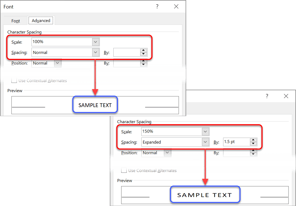
When creating a title, most people simply choose a large font size. While this is okay, as far as it goes, you can add a touch of professionalism by stretching or spacing the text. Both are found in the same dialog box.
1Select the text.
2Select the Home tab.
3Click the launcher in the bottom-right of the Font group. The Font dialog box is displayed.
4Select the Advanced tab.
To stretch the character width
Click the Scale drop-down arrow and choose a larger percentage, or simply type the percentage you require. 100% is normal width, 200% is double width and so on.
To compact the character width
Enter a smaller percentage in the Scale box. For example, 75% will compact the width to ¾ of normal size.
To add extra space between each letter (character) in the text
1Choose Expanded from the Spacing drop-down list.
2Enter a point size in the By box. For example, if you are using font size 20 and you expand the spacing by 10 points, you will add half a character width between each letter.
To make the letters fit tighter together
1Choose Condensed from the Spacing drop-down list.
2Enter a point size in the By box.
3. Raising or lowering text to re-align it
Some fonts are naturally positioned higher than others, and when you are mixing fonts or small graphics together the positioning might look awkward.
For example, in my training guides, keystrokes or button images are used a lot.
Here is a sample sentence. Notice how the bottom of TAB and ENTER sit on the baseline of the text.

After lowering TAB by 3pt and lowering ENTER by 5pt, here is the result. Notice how it flows more naturally.

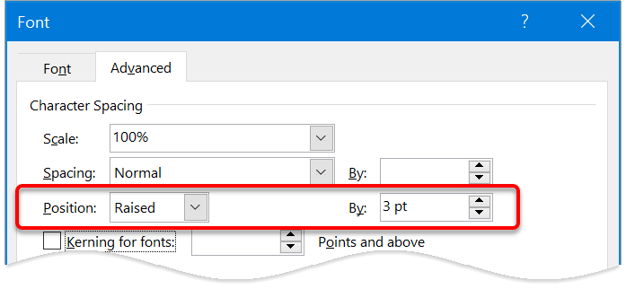
To reposition text in relation to the baseline:
1Select the text.
2Select the Home tab.
3Click the launcher in the bottom-right corner of the Font group.
4Select the Advanced tab.
5On the Position row, nudge the By arrows up or down.When you increase the By value, Position will switch to Raised.When you decrease the By value, Position will switch to Lowered.
4. Kerning
Kerning is a technique that was introduced with the printing presses in the 1800s. It recognises particular pairs of letters and positions them in such a way to make reading easier.
For example, an upper case ‘T’ followed by a lower case ‘i’ is kerned so that the ‘i’ almost sits underneath the bar of the ‘T’, rather than beside it.
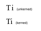
Not every pair of letters should be kerned but there are hundreds of character pairs that are kerned by professional publishers and printers.
Word knows what to do. You just need to switch kerning on.
1Select the text that you wish to kern (normally the whole document).
2Select the Home tab.
3Click the launcher in the bottom-right of the Font group. The Font dialog box is displayed.
4Choose the Advanced tab.
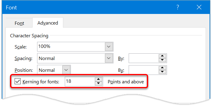
5Tick the box labelled Kerning for fonts.
6Specify a font size to be used as the cut-off point for the kerning. Any text of the specified point size and above will be kerned.
5. Ligatures and stylistic effects
Ligatures are two or more characters that are formed into a single character in order to create more readable or attractive text. Open Type fonts support four types of ligatures:
- Standard ligatures. Designed to enhance readability. Standard ligatures include “fi”, “fl”, and “ff”.
- Contextual ligatures. Designed to enhance readability by providing better joining behaviour between the characters that make up the ligature.
- Discretionary ligatures. Designed to be ornamental, and not specifically designed for readability.
- Historical ligatures. Designed to be historical, and not specifically designed for readability.
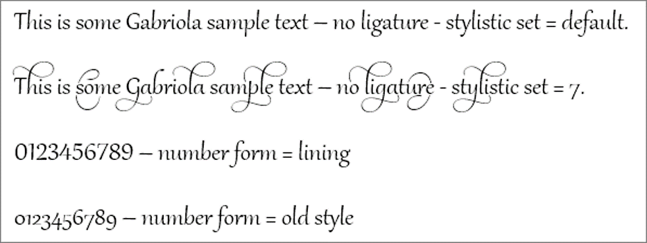
Modern Open Type fonts may come with a variety of stylistic sets available, but you often have to invest some time finding a good one. They may also come with different number-spacing options and number-form options.
Here is a sample of different combinations using the Gabriola font.
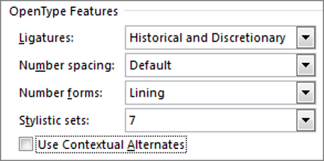
To experiment with ligatures, number-spacing, number-forms and stylistic sets:
1Select the document text that you want to format.
2Select the Home tab.
3Click the launcher in the bottom-right of the Font group. The Font dialog box is displayed.
4Choose the Advanced tab.
5Select an option from each of the drop-down lists.
6. Working with old conventions – How big is a point?
Whenever you see a reference to font size, it is specified in points, e.g. font size 10, font size 12. What is ‘point size’? How big is a point? Again, this is a historical convention that dates back to the 1800s.
There are 72 points in one inch.
Therefore, if you are using font size 12, the text size is 12/72 of an inch high when it is printed.
Put another way, 1 inch contains exactly 6 lines of size 12 text (6 x 12 = 72).
You never know when a fun fact like that might pop up in pub trivia quiz.
7. Adding a Drop Cap
A drop cap is where the first letter of the first word in the first paragraph is enlarged. A drop cap is usually added at the beginning of a new chapter or section.
This grabs the reader’s attention and guides them to the beginning of the text.
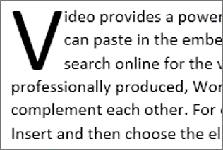
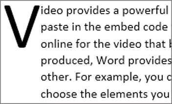
Drop caps are used in most novels and can easily be added to add a touch more professionalism to your document
1Select the Insert tab.
2Click the Drop Cap icon.
3Choose the Dropped style or the In-Margin style.
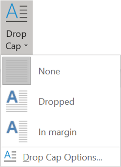
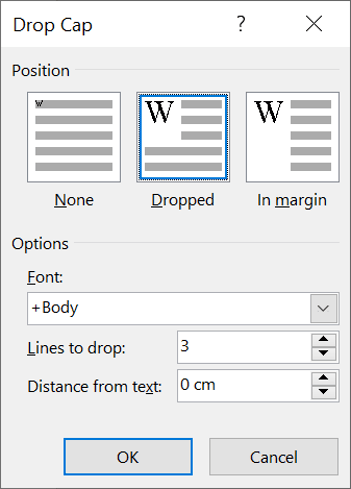
To change the settings, e.g. how many lines the drop cap should cover, click the Drop Cap Options in the menu.
8. Quick visual separators you can add with your keyboard
Type 3 dashes ( — ) to display a single line separator

Type 3 equals signs ( === ) to display a double line separator

Type 3 hashes ( ### ) to display a triple line separator

Type 3 underscores ( _ ) to display a thick separator

Type 3 asterisks ( *** ) to display a dotted line separator

Type 3 tildes ( ~~~ ) to display a wavy line separator

9. Many more amazing separators
There is also a Horizontal Line tool you can use.
1Position the cursor where the line is to be inserted.
2Select the Home tab | Paragraph group, orTable Tools | Design tab (if you are working with a table).
3Click the drop-down arrow on the Border icon.
4Select Horizontal Line.
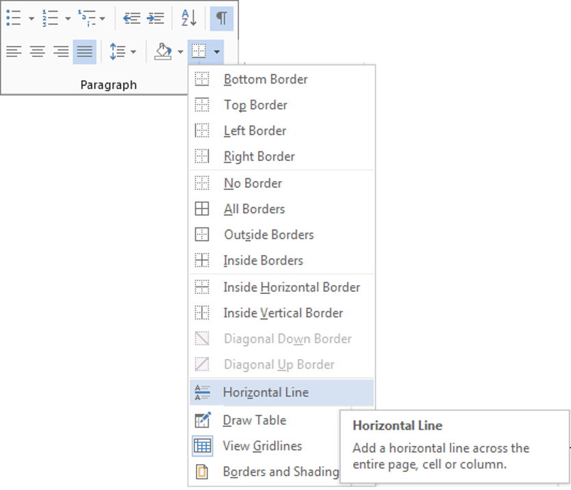
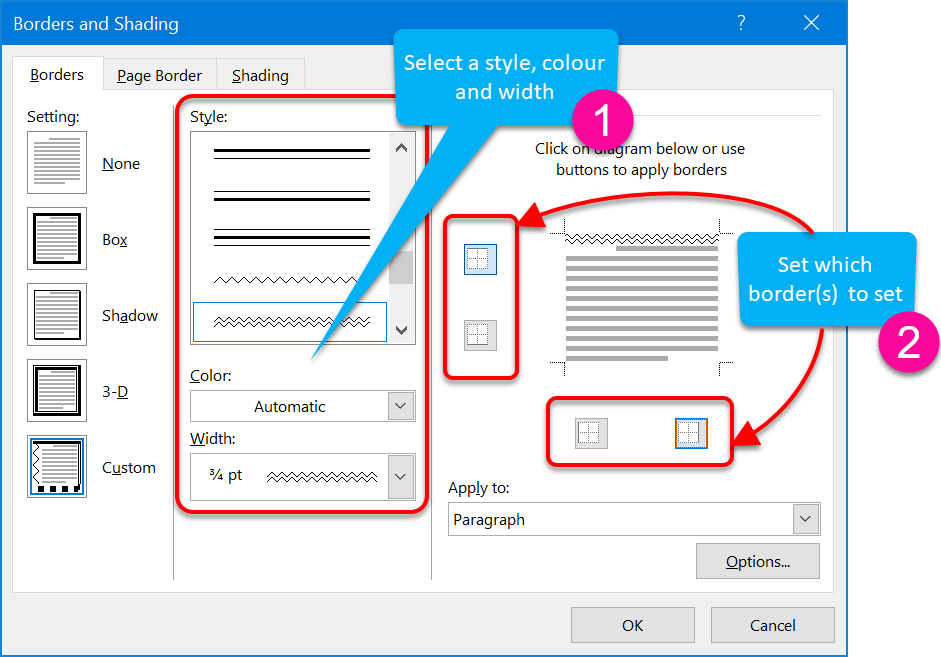
5For more choices, click Borders and Shading instead of Horizontal LIne.
6Choose a line style, line colour and line width.
7Click the border icons around the preview so that only the top or bottom icon is on.
You may also be interested in: How to create watermarks and sidebars
10. Key takeaways
- To superscript text (e.g. 360o) or subscript text (e.g. H2O), select the character(s) to format, display the Font dialog box and tick Superscript or Subscript on the Standard tab.
- On the Advanced tab of the Font dialog box you can stretch, shrink, spaceout, compact and kern text.
- For modern Open Type fonts, you can apply different ligatures, number-spacing, number-forms and stylisticsets.
- There are 72 points in 1 inch of printed text.
- To add a drop cap, select the Insert tab, click the Drop Cap icon and select a style.
- To add a single-line page separator, type 3 dashes followed by space or Enter.
- To add a double-line page separator, type 3 equals signs followed by space or Enter.
- To add an HTML horizontal line separator, click the Border icon (of paragraph or table) and select Horizontal Line.
- Standard or custom watermarks can be added to the document. Select the Design tab and choose Watermark.
- Custom watermarks can be either text- or image-based. Select Custom Watermark from the Watermark menu and complete the dialog box.
- Side banners can be added by inserting a graphic (picture, shape, WortArt etc.) into the header, then resizing and repositioning the graphic onto the main document body.

Jason Morrell is a professional course creator, consultant and trainer. He's the guy that people often sneak through the back door to fix up a hot mess that has defeated everybody. He takes on client projects and helps people of all levels unleash the power contained within Microsoft 365, simplifying tricky concepts and providing helpful, proven, actionable advice.
In his downtime he loves to shoot into the Gold Coast Hinterland on his Indian motorcycle and tend to his 47 pets (they all live in an aviary).
If you would like some 1-on-1 time with Jason to finally get that project finished - you know the one - then please reach out.


