Knowledge base
Excel Surface Chart: 3D, Contour & Wireframe Setup
Create stunning Excel surface charts to reveal data patterns and anomalies. This post walks you through 4 chart types, setup steps and expert customisation techniques.

First published: 24-Jan-2022
Last updated: 25-Mar-2026
5 min read
Surface charts allow you to plot your data as a two- or three-dimensional terrain so you can see the overall trend and any hidden anomalies that may be present.
In this post you’ll discover that there are 4 different types of Surface Chart and you’ll see how to prepare your data properly, create the chart then apply a number of options to customise and enhance the result.
- 1. The 4 Types of Excel Surface Chart
- 2. How to Create an Excel Surface Chart
- 3. How to Customise the Style or Layout
- 4. How to Add, Remove, Hide or Show Data
- 5. How to Switch to a Transverse Layout
- 6. How to Change the Surface Type
- 7. How to Add Axis Titles to an Excel Contour Chart
- 8. How to Reverse the Direction of Surface Chart Data
- 9. How to Rotate a 3D Surface Chart Excel
- 10. How to Reset Surface Chart Formatting
- 11. When to Use Each Surface Chart Type
- 12. Troubleshooting Steps
- 13. Frequently Asked Questions
- 14. Summary
1. The 4 Types of Excel Surface Chart
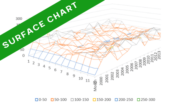
There are 4 different types of surface chart, each representing the data in a different way.
- 3D Surface Chart
- 3D Wireframe Chart
- 2D Contour Chart
- Contour Wireframe Chart
Here’s what each one looks like:


2. How to Create an Excel Surface Chart
Consider this data which shows the annual rainfall in Timbuctoo between 2000 and 2017. Data must have at least 3 columns and 3 rows.

To create a surface chart:
1Select any single cell in your data to allow Excel to auto-select the entire table range. Alternatively, select only the headings and specific ranges of data you wish to use.
2Click the Insert tab then the Waterfall, Funnel, Stock, Surface or Radar chart icon in the Charts group, or select Recommended Charts | All Charts | Surface.
3Click one of the 4 icons to create your choice of surface chart. You can switch later if you wish.

- Each value is colour coded based on its size.
- Values are categorised into numerical buckets (20-30 etc.).
3. How to Customise the Style or Layout
It’s always worth checking out the Chart Styles and Quick Layout options on the Chart Design ribbon for different pre-configured chart styles.

4. How to Add, Remove, Hide or Show Data
To add extra columns/rows of data to the chart:
1Click the Select Data icon on the Chart Design ribbon.
2Click the Add button.
3In the first box, click the appropriate column heading or row label. Or type a name for the new range.
4Click in the second box then select the new range to add.
5Click OK.
To remove columns/rows of data from the chart:
1Click the Select Data icon on the Chart Design ribbon.
2Select the Series or Category that you want to remove.
3Click Remove then click OK.
To hide/show data from the chart:
1Click the Filter icon in the top-right corner of the chart and untick or tick the items you wish to hide or show.
5. How to Switch to a Transverse Layout
1Click the Switch Row/Column icon on the Chart Design ribbon.
2Click it again to toggle back. This swaps the information on the axis with the information in the legend.
6. How to Change the Surface Type
1Click the Chart Type icon on the Chart Design ribbon. The Surface option will still be selected.
2Select a new surface type from the main window and click OK.
7. How to Add Axis Titles to an Excel Contour Chart
1On the Chart Design ribbon, click Add Chart Element.
2Hover over Axis Titles, click the little right-arrow that appears and then click Primary Horizontal and/or Primary Vertical.
3Click the default axis title that has been added to the chart then type a new name.
8. How to Reverse the Direction of Surface Chart Data
To reverse the data (i.e. display 2017 to 2000 instead of 2000 to 2017):
1Double-click anywhere on the chart to display the sidebar.
2In the sidebar, click the Options drop-down arrow at the top of the sidebar and select Depth (Series) Axis.
3Click the 3rd icon (Axis Options) icon (looks like a column chart).
4Under the Axis Options heading, tick the Series in reverse order box.
9. How to Rotate a 3D Surface Chart Excel
1Double-click the chart wall to display the sidebar.
2If necessary, in the sidebar, choose Wall Options from the Options drop-down menu.
3Click the 2nd icon (Effects).
4Click 3-D Rotation.
5Set the X Rotation, Y Rotation or Perspective as required.
10. How to Reset Surface Chart Formatting
If you’ve made multiple customisations and want to start fresh:
1Right-click anywhere on the chart.
2Select Reset to Match Style to restore the default formatting for your current chart style.
3Alternatively, click the Chart Design ribbon and select a different Chart Style to apply a completely new preset.
11. When to Use Each Surface Chart Type
Choosing the right surface chart type depends on your data complexity and presentation needs:
- Use 3D Surface Charts when you need to show continuous data relationships with colour-coded values. Best for presenting smooth data trends to a general audience.
- Use 3D Wireframe Charts when you want to emphasise the shape and structure of your data without colour distractions. Ideal for technical presentations where the terrain topology matters most.
- Use 2D Contour Charts when you need a top-down view similar to a topographical map. Perfect for printing or when 3D perspective isn’t necessary.
- Use Contour Wireframe Charts when you want a simplified top-down view showing only the data points and contour lines. Best for focusing on specific data boundaries.
12. Troubleshooting Steps
13. Frequently Asked Questions
14. Summary
- Excel surface charts transform grid-based data into visual terrain maps, revealing trends and patterns across three dimensions.
- You can choose from 4 chart types (3D Surface, 3D Wireframe, 2D Contour and Contour Wireframe) depending on whether you need colour-coded values, structural emphasis or a top-down view.
- Creating a surface chart requires properly formatted data in a grid layout with row and column headers. Once created, you can customise the chart by rotating the perspective, switching between chart types, adding or removing data series and adjusting the colour gradient.
- For best results, ensure your data contains no blank cells, experiment with rotation angles to find the clearest view and choose the chart type that best highlights your data relationships.
Shhh! Keep this to yourself but Jason is the guy they sneak in the back door to fix Microsoft 365 disasters when all else has failed. He's quite the straight shooter, breaking things down into simple steps and giving you advice you can actually use.
Yes, he takes on client projects and 1:1 troubleshooting so if you would like to finally get that project finished - you know the one - then go ahead - just reach out.

